Saturday, August 25, 2012

Layered and Textured Garden Painting


This week, I had fun playing with a textured grid of collaged images and paint.  The final abstract painting includes about six layers of collage and paint. I created my own English cottage garden.


The first layer is paint chips in the colors that I wanted the final painting to be.  The second layer as seen above is made up of garden, plant and flower images cut into squares and collaged onto the canvas.

Then, I painted over the second layer to set the scene, added another layer of collage.  I added paint to several of the collaged images, added another layer, added a layer of tissue paper flowers and the humming bird. To emphasize the humming bird, I painted his breast red (see top photo).  I could do a whole series of these paintings.

Tuesday, August 21, 2012

Abstraction with Surface Texture

Our second abstract landscape class with Cynthia Herron focused on abstraction through surface texture. Her paintings include a one or more layers of texture often as the under ground.  We each received a 6x8 inch board already textured.  Layers of green and blue tissue paper were glued onto my board.  I selected a photo of a bird sitting on plant stalks to paint on the board.  Then, I mixed up some hard molding paste with buff titanium and red oxide paint to roughly match the stalk color.  In the photo, the stalks appear to be very textured.


I wanted to simulate this texture-

Next, I painted the stalks and the bird, added another layer with a tissue paper drawing I did of tree leaves.


Other students used different textured boards.  Below, the texture was created with heavy gesso applied with a palette knife-


a gesso layer with crumpled tissue paper on top-


more layers of decorative and tissue papers-

a layer of molding paste-

The local artists Cynthia referenced for our class are Sharon Geraci, who teaches at the Multnomah Arts Center, and Eunice Parsons.  Both use collage materials in their paintings for surface texture.  I'll attempt to get photos of these works in progress as they become finished for the next post. 

Monday, August 13, 2012

Abstract Painting with Cynthia Herron

Last week, I started a class in abstract landscape painting with Salem artist, Cynthia Herron.  Portland Art Collective members, Dayna Collins and Tory Brokenshire, took this course last Spring and highly recommended it.  I want to be looser in my artwork- both drawing and painting.

I selected a photo from a trip to Sedona, Arizona a few years ago. 

Here's my underground color and under drawing.  I distorted the shapes of the rock formations and clouds.  The yellow under painting represents the hot day.


Then, I blocked in the colors to get the feel of the hot day and the energy of the Vortex in this area.  The values of the blues in the sky are exaggerated from dark to lighter.  The red rocks deflect the heat. The painting is not complete.  The foreground needs more detail and contrast in color.


I was so impressed with the work of fellow students. Thanks everyone for letting me post your paintings. Luanne Kreutzer used a photo from a rafting trip she took on the Colorado River.


Dana Gibbons worked from this photo of a farm.


Chris Vietmeier used some enlarged photos that spoke to her.


Sandy Keating chose a photo from a vacation in Florence, Italy to paint.

All are works in progress. I love how the use exaggeration and distortion of the shapes and forms creates different feelings in each painting.  I can't wait to see what we create next week with abstraction through color.

Monday, July 30, 2012

Tutorial on Using Uncial Lettering for Bookmarks

The past few weeks, I've taken an Uncial lettering class at Multnomah Arts Center with Christine Colasurdo.  For our final project we used uncial letter forms to cut stencils.  I made bookmarks.

We used two pencils taped together to get the letter forms.

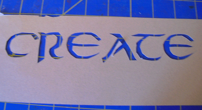
I made adjustments for cutting a stencil and copied the word into Photo Shop to re-size it to the bookmark size- 1 3/4 x 9 inches.  I used this copy to cut the stencil on cardstock with an xacto blade.


Here's the cut stencil-


Then I spray painted the stencil onto decorative paper.


For the final bookmarks, I trimmed the edges to size, outlined the white letters with a marker, rounded the corners with a punch and and punched a star into the letter "R".  Each classmate will receive one in class today.

The inspiration for this project came from Christopher Calderhead's new book entitled, Calligraphy Studio: the ultimate introduction to the art of hand lettering.


Monday, July 23, 2012

Pointed Brush Calligraphy with Marilyn Reaves

Marilyn Reaves taught the second workshop that I took at the NW Calligraphy Conference at Reed College.  She teaches classes in lettering, design, drawing and book arts at the University of Oregon.  I wanted to learn how to use a brush to letter so that I could use watercolors and gouache for calligraphy in my artwork.  In class, we worked with acrylic inks and selected a theme for our lettering.  I chose my garden as subject matter.  We played with collage-  lettering on Japanese-style papers and layering with decorative papers and fabrics. I added one of my drawings, too.

The alphabet below I did with watercolors wet on wet on cold press paper.  The letters would be more even on hot press watercolor paper. I like the texture of the letters on cold press.


Friday, July 6, 2012

Spontaneous Mark Making with Pamela Paulsrud

Last week, I attended the NW Calligraphy International Conference here at Reed College.  My head is still spinning with all that I learned.  It was fun to meet scribes from all over the world and to see the breadth and depth of lettering arts today.  Pamela Paulsrud taught my first 2½ day workshop called 'Spontaneous Mark Making'.  We used a variety of tools, items from nature and calligraphy pens to practice mark making with Sumi and walnut inks.
Then, we used a view finder to cutout the marks that we liked the best from our practice sheets.
I like the flow of the spontaneous lines made.  The top left one has a white crayon resist added.  The ones below are all made with Sumi ink.  The wet on wet creates many shades of gray and feathery edges.


We made a card holder out of black cover paper and I added a strip with one of my marks on it.


We completed several exercises with our own handwriting varying it with use of dominant and non-dominant hands, size of letters- a stream of consciousness.  The Sumi ink marks on the black cover show up better than I thought they would.  We used this paper to make covers for our portfolios.


Inside is an accordion folded portfolio with a sink washed Sumi and walnut inks.  I love the contrast in color and shades of gray made by the washes.  The line across the page reminded me of a river.  I happened to have some old maps of the Columbia River and did some toner copy transfers along the bottom .


Pam asked us to include an element of surprise.  Can you see it in the detail below?  Click on the photos to enlarge them.   It's along the river to the left of the map.  The second detail  photo shows the surprise on the right side.


Living in the NW, the Columbia River and its Gorge play an important role in our landscape and lives.  The preservation of salmon is a key river issue.  The fish are the little surprise in my river.

I was very fortunate to sit between two very accomplished artists and calligraphers during this workshop.  Check out their work here-  Yuko Wada  and Yukimi Annand.  You can see the inspiration that I received this week from the lettering arts world at the Guilford Art Center calligraphy exhibit.
Wednesday, June 20, 2012

Celebrating Solstice with Weathergrams

Happy Summer Solstice!  This morning, I hung my weathergrams that we created in our calligraphy class, one from each student and our instructor, Christine Colasurdo.  Famous Portland calligrapher, Lloyd Reynolds, encouraged his students to make weathergrams to practice their Italic hand on recycled paper (grocery bags), honor nature with their own written poems or haiku and hang them in the garden each season.  At the Fall Equinox,  I'll replace these with ones to celebrate autumn.  The idea originated with the Japanese who exchange tanzaku paper strips with their hand written messages.


 Mine are stamped with a hand-craved eraser stamp and Chinese vermillion ink.

Here are the weather grams of fellow students....

It will be fun to see how they 'weather' and deteriorate during the summer season.  I will enjoy seeing them outside my studio window flutter in the wind and change with time .
Next week, I'll be attending the Calligraphy Northwest, the 31st International  Conference for Lettering Artists, at Reed College where Lloyd Reynolds taught calligraphy.  The Portland Society of Calligraphy, which Reynolds established in 1969, is sponsoring the conference.  Each member who joins the society receives a copy of Reynold's Weathergrams book.  An exhibit of members artwork is on display in the Pearl Room  at Powell's City of Books until July 3rd.  I'll share with you some of my experiences the first week in July.